Help with colour correction - my prints don’t look like my screen!
Short
Tough to answer briefly because it’s a rabbit warren of facts and theories, but essentially it’s about how a screen radiates the picture at you, and a print requires light bouncing off it.
The physics of viewing a screen and a print are hugely different and it takes a few factors to be spot on for it to work well.
Screen technology: Very few screens are designed to simulate print. Screens such as an EIZO Color Edge needs to be set up and calibrated. And when is it properly set up, an inexperienced viewer can see pictures on the screen as flat, dark and warm. Most screens these days are made to excite your eyes being over bright, and very cool in colour.
Print viewing: To see a print, light has to bounce off it, so what colour and how bright is the light you are viewing your prints under? What is the quality of the light? Can it render the full colour spectrum? These all affect what a print will look like.
Experience: Seeing a screen to print match requires doing it quite a lot, you need to see your work printed to understand what to expect. Also, we have to ask…you may not be ‘colour blind’, but you may have deficiencies in certain aspects of the spectrum.
Read on if you want to really get into it.
Long
Colour is a tricky devil. Most of us can recognise a picture with off colour, but not many of us know how to fix it. Having pioneered colour printing in Australia, we have sunk many years into the art and how to help others with it.
Perception.
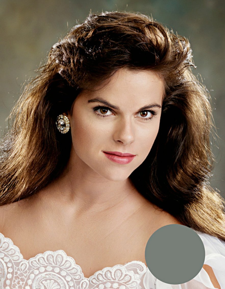
What do you think good colour is? What do we think good colour is? What exactly was that colour? These are all tricky questions, and we all have different opinions. There are however some basic colours humans agree on; grass is green, sky is blue...etc. One of the big ones, is that skin tone must look 'pleasing'. Skin is neither green, red, blue nor yellow, is it a subtle mix of them all, and preferably not predominantly green or red!
For us to help you with your colour correcting, you need to know what you like and importantly, what your subjects like. We have a fairly strong opinion of what good skin tone is, and it has varied throughout the years as trends come and go (from Vampires to Jersey Shore). Our job, is to work with you to render what you expect on your prints.
Colour Blindness.
That being said colour correction is not for everyone. To begin with approximately 7% of the male population and .04% of the female population are colour blind. So physiologically there may be an issue if you are finding colour correction difficult. The best path to assessing colour blindness is an appointment with an ophthalmologist to get yourself tested.
The Brain.
You brain's adaptiveness is a big hurdle to consistent colour perception. You visual system adapts to all lighting conditions. If you are in a red room, you might initially perceive the redness of the light, but rapidly your brain will balance out the red by adding in a cyan bias (the opposite colour) into your perception of colour. Being aware of this, and evaluating colour problems as quickly as possible will help negate the adaptation. Your first instinct for the colour of and image will be the best. As you look at it longer, you will begin to accept the colour as being good. How insidious is that!?
The Environment.
This all means you need to assess colour in a controlled environment. Your 'assessing room' must be neutral in colour, and the lighting must be a high quality simulation of daylight.
Daylight.
'Daylight' is a standard that is more than the light outside. It is the light emitted from a black body radiator at 5200 degrees Kelvin. The sun is the original black body radiator. A tungsten light globe, although very yellow in colour (a low Kelvin temperature), is a black body radiator. The Eiko Solux halogen light globe (4700 degrees Kelvin) is the closest match to daylight in the combination of quality and colour.
By quality, we are meaning CRI, or Colour Rendering Index. Daylight made by the sun is 100% CRI. Accurate, consistent colour correction should be done in 96% and above. Many "daylight" fluro tubes and LED lighting is well below that...Do also be aware manufacturers often obscure CRI information, and sometime falsify it, contact us for advice on lighting as it is critical to evaluating print colour, because seeing a print involved light bouncing off it, that light is important.
Screen quality.
What you view your digital images on is critical. The screen is effectively printing the image, and there are only two screen manufacturers we trust. EIZO and their Colour Edge range, and NEC and their Spectraview. Personally we only recommend the EIZO Color Edge monitors. A good quality screen is everything. It must also be paired with a capable graphics card, cables and software. Both of these manufacturers make high bit depth displays than enable the adjustment of the image to simulate print. In an ideal world, one of these monitors would be coupled with a high bit video card, but this is a discussion for serious digital colour enthusiasts.
Screen calibration.
Even the best screens need to be calibrated. Calibration will help the worst screen work at its best. A screen needs to be calibrated as often as it changes. An old or poor quality screen may need weekly calibration, a good quality new screen should need calibration every month to three months, We recommend the ColorChecker Display Pro for screen calibration, you might notice it has changed from being an X-Rite product, but the instrument is the same . We have had constantly better results using this and the i1Pro from Xrite than any other tool.
During the calibration process, you will be asked to choose target values, these are our suggested numbers
5500 K (degrees Kelvin) as target white balance.
90 cd/sqm brightness.
Atkins provides a screen calibration service, we can visit and calibrate your screen, or you can bring your screen and computer in to the lab (with cords and cables). There is a charge for this service. If you are interested, email for an appointment.
Projector calibration is something Atkins can also help with. The calibration use-by-date of projectors is a little trickier than a screen as there are more variables in the system. It depends on the projector (and illumination source) age and manufacture quality. The better quality and newer the equipment is, the more stable. The calibration is a snapshot of a moment in time, it is a capture of the computer setup, hardware, video card, cable performance, screen and ambient room lighting. As soon as anything changes, the profile becomes less useful.
In practise, without being really fussy, you can go a year between calibrates. But, if the calibrate has to move the colour and brightness a long way from where it naturally performs, out of the factory, then a small shift can actually make things look bad. So someone has to be on the ball, assessing the performance by eye to decide when it should be recalibrated.
Colour Management Settings
In Adobe Photoshop, you should set your RGB editing colour space to AdobeRGB, and also ensure you always embed the ICC profile in every image you make. This will communicate your colour settings and prevent dramatically wrong prints. Always convert to a profile, and never (almost never) assign a profile. The only time to assign a profile, is if one was missing. Contact us for help with this if you need to.
Reference images.
The secret to colour correcting, is to not rely on your colour memory. It has be proven that the human brain does not have good colour recall, especially when it comes to the subtlety of colour correction. Our most experienced operators always use a reference image to guide their adjustments. A reference image is a digital file that prints through the print system well. It is an image that contains a range of colour and tone and most importantly skin tone. Skin is critical to get right. using a reference image is simple, just open it up when you are adjusting your images and have it there to compare with. be careful to be sure the reference image does not get edited by accident, to avoid this, make the file read only. We at Atkins use many reference images, but our most commonly used image is our Kodak Shirley, there is a version below that you can download.

Soft proofing.
One of the benefits of having a great monitor (such as and EIZO Colour Edge) freshly profiled is you can use printers' profiles to 'soft proof' your image. Soft Proofing is the process of using your monitor and it's display profile to simulate the material and print process, being printed on, therefore getting a reasonable idea what your on-screen image may print like.

 The process creates an image on the screen that represents the paper's ability to reproduce colour and highlight and shadow information, plus any mid-tone colour biases. The big challenge however, is for your brain to perform the gymnastics equating radiated light from your screen to reflected light from a print! So beware, a lots has to be a good place for this to work.

At the end of this paragraph is a link to download a zip file filled ICC profiles that we use, they are not all the final print profiles as we have multiple machines printing multiple papers, the actual list is huge, but these are the key profiles averaged. They should be helpful if you have all the other ducks in a row. If you want help setting up your soft proofing, please call for an appointment. Atkins Production Profiles.

Training.
Atkins regularly trains clients to improve their colour correction skills. We have successfully helped hundreds over the years through seminars and training videos, one on one training with our specialists here at the lab.

Testing and tweaking.
This involves us looking at your work and giving feedback. This also involves us supplying back corrected files from what you have supplied us, and phone conversations or screen sharing sessions to step through where we think your issues lie.
The place to begin is testing….send us some test prints. Not just your favourite best looking images, they do need to representative of your work, but choose those that are edge cases, you are worried they’re too dark, or too light. We’re on this journey with you, it is best for all of us to get this sorted as soon as possible.